icon’t get enough
Jul. 23rd, 2025 21:53Well this was unexpected… but it seems like over the past week I’ve become addicted to making icons.
Back on Tumblr I was really into GIF making, so I guess icons are just the LJ/DW equivalent of that. Similar to how the limitations of GIFs posed a fun challenge, the tiny 100×100 format adds a layer of difficulty, especially when you’re also trying to keep HiDPI screens in mind. I had to mostly give up in the last part, since making something look crisp when it’s technically blown up by 100% is borderline impossible if you’re not working with pixel art.
Anyways, here are the capital I Icons I’ve made so far:
☙ Rainbow Pass-it-On on ![[community profile]](https://www.dreamwidth.org/img/silk/identity/community.png) iconthat
iconthat
This was a super fun challenge and a great intro to icon making. I basically got to observe and learn from the other users in the comm for the whole week. It was really inspiring and motivating; I definitely didn’t start with the intention of getting a full rainbow, but, well…
 Red
Red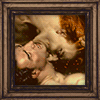 Orange
 Yellow
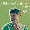 Green
Green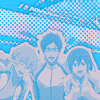 Cyan
Cyan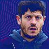 Blue
Blue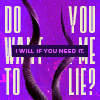 Violet
Sources and Credits
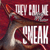
- The sneaky Barbaridactylus from Prehistoric Planet
Nick Amo @ Unsplash, Peter Olexa @ Unsplash - Detail from William Adolphe Bouguereau’s Dante and Virgil in Hell (1850)
Alex Moliski @ Pexels, mk. s @ Unsplash - Ai Ohto from Wonder Egg Priority
- Molina from BBC’s Wolf
- Nagisa, Rei and Gou in Free! Take Your Marks
photo used for the BG texture: Andre Noboa @ Unsplash - Joe from Y Golau
- Paraphrased quote from Tarrik in Beautiful Monsters (Jex Lane)
Ingrid Behrens @ Unsplash, Annie Spratt @ Unsplash
Red coincidentally was my first entry. I recently rewatched Prehistoric Planet for the 10th time—peak dinosaur media if you ask me—and the femboy sneaking male pterosaur immediately came to mind, since he still had the red coloring. I also had a lot of fun with the background textures; trying out different layer modes and getting used to how the photos scale on the small canvas.
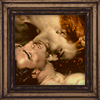
Orange was my final entry to complete the rainbow, and I wanted to go for a different source medium here. Despite being a huge stan of the Age of Enlightenment in real-life society, Dark Romanticism is my favorite literary/artistic movement and paintings like this one are part of the reason why. I adore it. I picked it out for this to represent my digital collection of paintings featuring semi-homoerotic wrestling. Then I added a picture frame because I hadn’t done that yet and then I also overlayed a video of embers before remembering that animated icons weren’t allowed. Whoops.
Yellow: I still haven’t finished watching Wonder Egg Priority because I’ve heard how bad the writing gets in the second half. Still, I wanted to give Ai an icon with a cute purikura/stickerbook vibe.
Green: “I think we’re alone now~ There doesn’t seem to be anyone else around~” This is one if my favorite shots from Wolf (Knifey Molina 💖🥰💖) and it was basically screaming for a composition with a lot of negative space.
Cyan: The Free! icon went through approximately 10000 changes from crop to contrast to color to background. I was so happy when somebody commented on it having an otherworldly feel to it because I was struggling so much with the colors and contrast to get there. :D
Blue: Another Iwan Rheon appeared! He used “pathetic sad man” on holyscream! It was super effective! I have an embarrassing number of Joe Pritchard caps and immediately knew I wanted to use one in this challenge. Y Golau has really nice color grading, so I had to do almost no masking or selective color editing. I got the purple from his clothes and did my beloved outline spam with it. In the process, I noticed that there’s a limit to how many outlines can be added to one Photoshop layer, but thankfully you can just stack effects via groups and smart objects.
Purple simply had to be Tarrik-themed. Hard Amethyst, my beloved. That damn quote—“Do you want me to lie to you? I will if you need it.”—still has me in a vise-like grip, so it received another tribute in form of this icon. I was very surprised by how small I could make the text even with a vector font; you can even still see a bit of Nocturne’s characteristic shapes on some letters. This icon might have been the most fun to make because I just went for the Do Want To Do Me Lie? spacing and generally just treated the type as a graphical element.
( Obligatory Blood Prince 2025 release summoning circle: )
🕯️
🕯️ 🕯️
🕯️ 📕🪨 🕯️
🕯️ 🕯️
🕯️
☙ Jump for Joy on ic_animated
 [ Naru ]
 [ Rin ]
 [ Tadashi ]
 [ Mirai ]
 Chitose
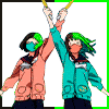 Miko & Mako
Sources and Credits
- Naru, Rin, Tadashi & Mirai from Love Cotton by Chan Kashinoki
Ribon Collection 2009 Calendar - Chitose from Girlish Number
- Miko & Mako from Wonder Egg Priority
It took me forever to find characters beaming and leaping for joy in my collection—and then I got nervous about Love Cotton not being an animated property, so I scrapped the set I made (gonna have to ask in the comm if the description mentioning comics is up to date). Except for the Rin one, the icons didn’t turn out as I wanted anyways, so it was overall a good decision. I’d still like to do more stuff with some of my old tweenage manga favorites in the future.
Miko & Mako are such a hilariously messed up character concept and execution (RIP, I dyed the border in their oshi’s colors in their honor) and Chitose is already a different type of icon, so I’m glad to have DW icons dedicated to them now, too. I played around with different effects and filters on Chitose’s and I’m surprisingly happy with how it turned out.
☙ and these
 Bocchi-chan
 Deok Cerise
Sources and Credits
- Bocchi-chan/Hitori Gotoh from Bocchi the Rock!
- Deok Bokhee from I’m Yours, Blood and Soul
Bocchi-chan was my first icon (for nexticon, which I had been too shy to join for months), so she is very special to me even if I struggled a ton with the small format. I’m used to working on huge files and scaling them down on export, but you lose so much detail when you shrink stuff down to 100px.
The “Deok Cerise” icon was unsurprisingly inspired by the Rainbow challenge, when I realized how fun icon making is and that I wanted a dedicated graphic for the topic. I love my Stańczyk icon, but the juxtaposition between his morose face and my enthusiastic participation was just a bit too comical. GyaGa’s art for I’m Yours, Blood and Soul is gorgeous and vibrant with a pink undertone throughout, so it lent itself to the color chip idea which I’d originally wanted to use for an S Flower icon (also a webtoon with gorgeous art). The 21-8102 is based on the length (21 chapters) and relese year (2018).
☙
With all of these icons made, I of course also had to build myself an icon table with flexbox, because the lack of automatic wrapping for the HTML tables on mobile drove me nuts. Honestly, I’m so grateful that Dreamwidth gives us this much control over our blog entries. 🥹
I don’t know if this might be useful to anyone else, but if you read ↑ all that ↑ you deserve at least some form of compensation.
Also I think I was really brave for not making a single Ramsay or Frank icon. God gives his hardest battles to his weakest soldier but I try my best 😔🙏🏽
no subject
Date: 2025-09-07 13:34 (UTC)Slippery slope, that. :D I remember when it happened to me. That was like... a few weeks after I joined LJ... in 2003?, and I haven't stopped since. :D
no subject
Date: 2025-09-08 14:14 (UTC)no subject
Date: 2025-09-13 07:24 (UTC)When I started out, a lot of makers were in arts/design professions and it was very competitive and they viewed it as part of their... idk, job skill development? Luckily, I never had that pressure, so it just always felt relaxing to me and I kept learning at my own pace, just the way I like it.